Virtus Fitness Club
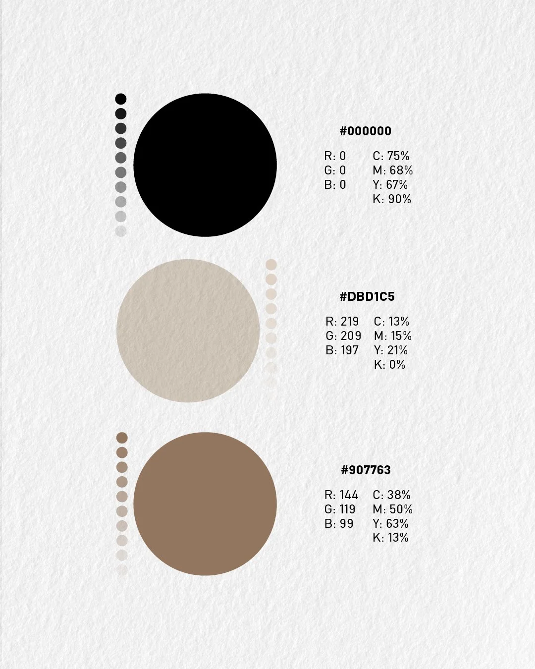
Virtus takes its name from the Latin word for virtue, courage, and excellence—values that extend beyond physical strength and define a disciplined mindset.The visual identity was developed to reflect these principles through a bold, minimal, and timeless design system. Strong typography, a refined color palette, and clean graphic elements create a brand that feels confident, premium, and purposeful.
Rather than focusing solely on fitness, the identity positions Virtus as a space where resilience, self-improvement, and consistency come together. Every design decision was made to communicate strength with clarity, building a brand that inspires both performance and character.